Mango grove
Mango grove is a networking site that aims to connect young professionals to mentorship opportunities and provide encouragement in a positive environment.

CHALLENGE: Perform analysis of Mango Grove to determine opportunities for improvement
SOLUTION: An improved website that increases the website’s capability to allow professional networking connections, increases personalization of site, and increases individual user connectivity.
METHODS: Heuristic Evaluation, Lab Usability Tests, Remote Usability Tests, Prototyping
TOOLS: Trello, Axure
PROBLEM: increasing connectedness online
I worked as a member of a 5 person team to evaluate the website Mango Grove, a platform intended to help young professionals begin the networking process. It is intended to be an accessible community for professionals to share success stories and encouraging words with each other.
Discovery & methodology
Research is a core component of user experience design. Everything in the UX design process should have a reason, otherwise it’s a waste of a developer’s time—and a waste of the client’s money.
A common form of research in UX is usability testing, which is exactly what it sounds like: the research team is testing the usability of a product to evaluate a product; to gather insights on how that product can be improved in order to update it in a meaningful way.
Essentially, you are observing the experience of individuals to get qualitative data (things like “I’m frustrated” or “that was unexpected”) and organizing that data from a group of people into quantitative information that can be passed along to stakeholders and developers.
Research Goals & Methods
Our team wanted to identify opportunity areas to update the website in a way that would make it more valuable to users. We did this by evaluating how well a user could perform the primary tasks on the site, gathering insights on the value of Mango Grove as a professional networking platform, and attempting to gain an understanding of existing methods of online networking used by those looking to advance their career.
In order to get information about Mango Grove’s purpose and capability, the research team first performed a heuristic evaluation of the website to determine focus points for the study. We developed a task-based usability test with the findings from that investigation. Participants navigated the site using the think-aloud protocol, sharing their thoughts and insights with the research team as they went. Raw empirical data was collected and organized by the research team using the affinity diagram method (see data collection method below).

Participants & Tasks
The usability test of Mango Grove was conducted by 5 researchers and included 13 participants who were a mix of working professionals and college students.
Three participant interviews were conducted onsite at Fathom consulting in Minneapolis, MN, and ten participant interviews were done remotely by individual researchers. Tests were performed using a combination of onsite and remote test sessions, lasted approximately 30 minutes each, and were moderated by a researcher.
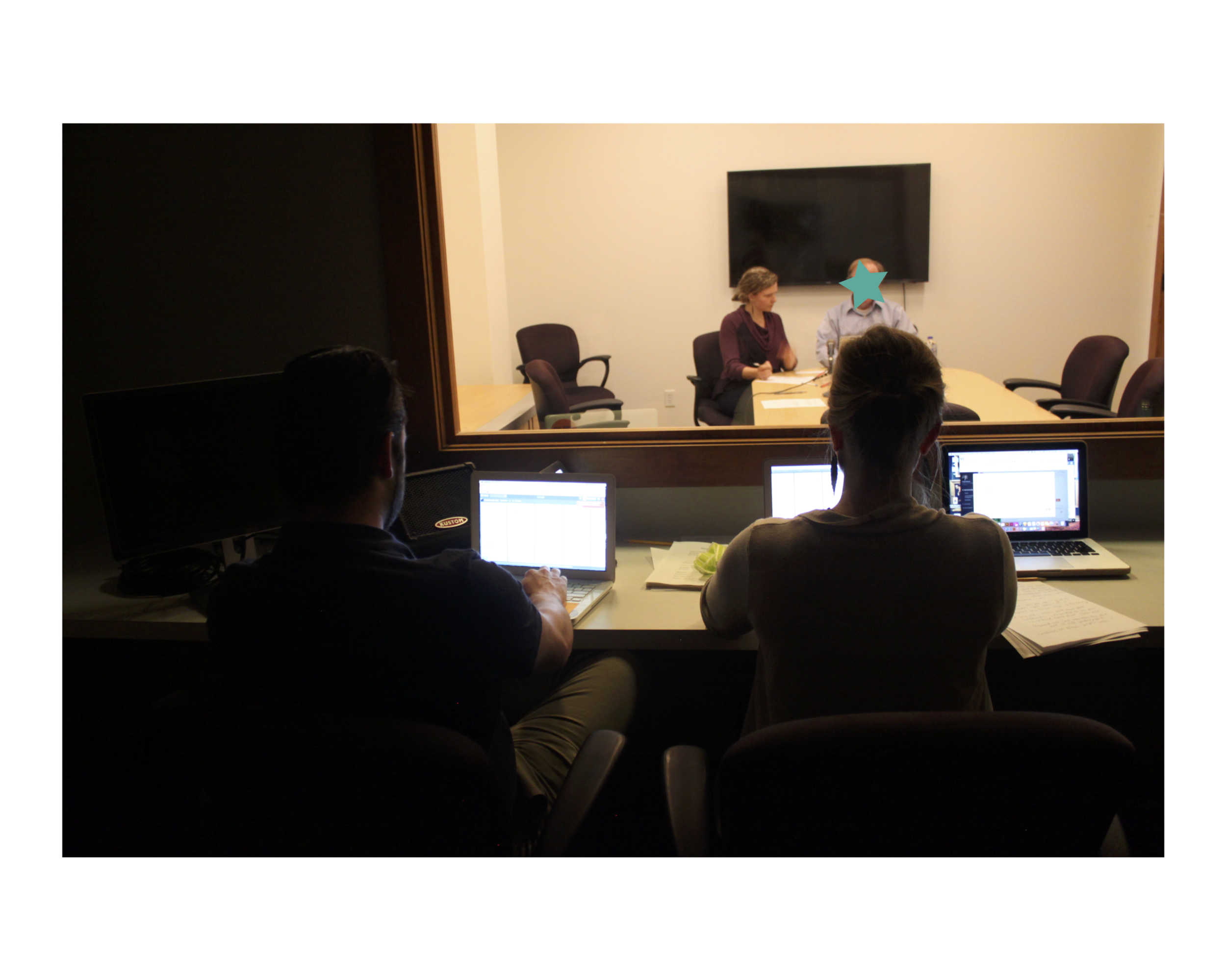
Usability Test in Lab

Usability Test: Remote

Writing the Usability Test Script
We evaluated the ease or difficulty with which the participants were able to complete the following tasks:
-Make and respond to posts and participate in a community discussions
-Join a community
-Report, flag and moderate offensive posts
-Begin to grow a professional network
Tasks were embedded in scenarios like the ones below:
“Show me how you would share something exciting that happened this week.”
“As a site administrator, it is your job to monitor posts that people think are offensive. Show me how you would do that.”
and “Show me how you would start to grow your professional network on the site.”
Findings
We found several successes, including ease of participant registration as well as ease of flagging and deleting offensive content.
However, there were some major opportunities for improvement, including clarifying the purpose and experience of the website (many users had to be told what the site was for), increasing feedback and navigation during use, and increasing connectability and personalization—things that are expected as baseline requirements on a social media site. Many users experienced difficulty with the tasks, particularly the question of how to grow their professional network on the site.

Essentially, Mango Grove has much to offer, but requires significant attention to make it strong enough to stand up in a competitive market alongside other social media and professional networking sites. Implementation of recommendations and continuing to work with users would ensure a more robust, appealing and user-focused site.
Going into this, I expected it to be easier—but I learned some important lessons along the way. One of the best lessons of the week was to set better goals and know how to measure the outcomes; the second best was to be flexible and able to adjust when a new goal or insight presented itself.
In research you have to be flexible. You have to know where you’re trying to go, be incredibly prepared, and be willing to throw your plans and assumptions out the window when something unexpected happens or some opportunity presents itself.
It was harder than I expected: setting aside my first impressions of the site and working in a methodical way to find the most valuable insights to make changes. Many of my hypotheses were validated, but some of the things that seemed like a big deal to be at the beginning of the research process were unimportant to users.
I am getting better at thinking about those goals, getting better at defining the framework for the goal of research before I begin and asking better questions—why am I doing what I’m doing? What am I asking? How do I measure the outcome, especially when I don’t yet know what the outcome will be?
solutions and prototype
RECOMMENDATIONS
So what do we do now?
Let’s talk about specific findings and recommendations order of severity.
Severe and persistent issues
The purpose of the site is networking, but users were unclear on how to network within site capabilities. Most users indicated that LinkedIn already exists and works well and that the usability issues of Mango Grove gave them no incentive to switch. Another major purpose of the site is positivity and inclusion, but users’ emotional response was confused and indifferent. Most participants expressed a desire for user profile capability and the ability to view other users’ personal information.
Participants were unhappy with the site's lack of feedback— many expressed frustration that there was no indication their action had been completed. They were confused by the site’s overall navigation; specifically the left navigation paired with the horizontal community selection.
“Hmm... there was no feedback that [my post] was successful at all. I'm not sure that it worked.” -Participant 2, attempting to post in a message board
Recommendations
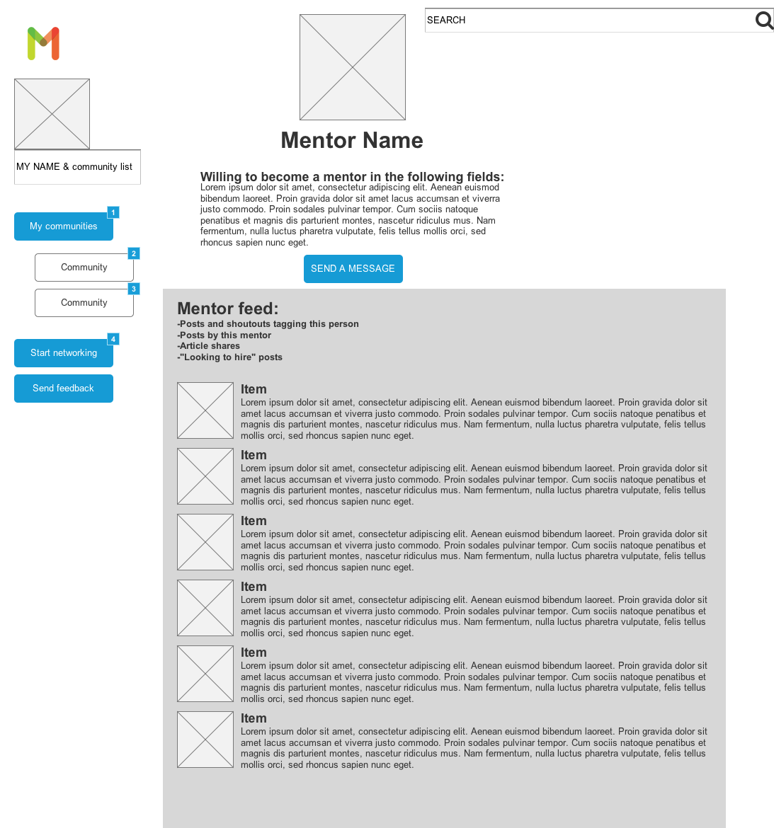
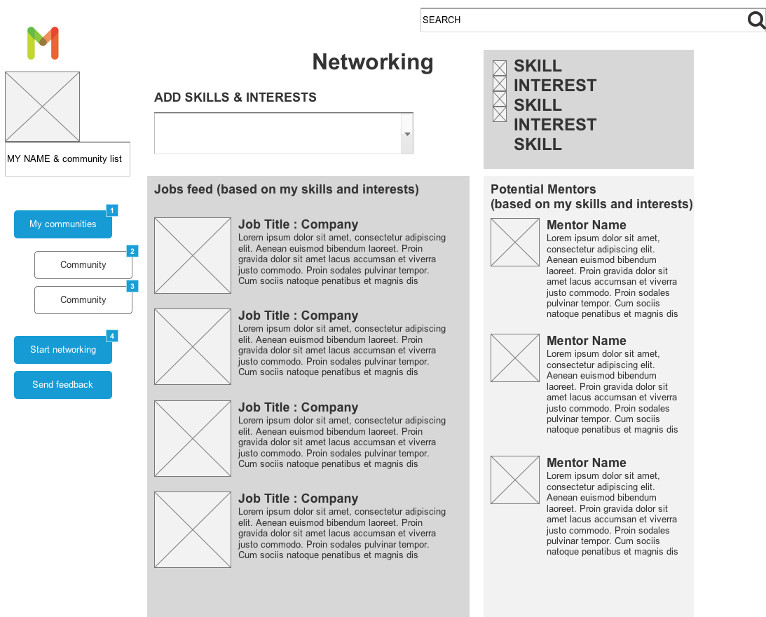
-Increase site’s capability to allow professional networking connections between individual users
-Increase personalization of site by adding profiles
-Increase individual connectivity by allowing personal messages and
tagging capability
-Allow users to express emotion with image sharing, GIFs and emojis.
-Streamline navigation by reducing to single, clear navigation panel
-Increase visibility of site mapping and system status by increasing the amount of feedback (e.g., “This post has been made to the Macalester board” or “This post has been flagged and a moderator will be notified.”)
-Allow users to edit and delete their posts.
-Enable notifications so users know when someone has responded to their post or given them a Shout Out
Medium Priority Issues: Modal Popup and Email Input
Users repeatedly expressed annoyance at the Modal popup. Despite selecting the “Do not show message again” option, popup returned at unexpected times, particularly when users clicked the “Get started” navigation option. They expected this menu option to allow them to either begin the networking process or create a user profile.
Users were annoyed by the requirement to input their name and email address every time they posted or commented as a guest.
Recommendations
-Popup modal was helpful to first-time visitors, but participants were annoyed by its repeated appearance (whether or not they had selected “Do not repeat this message.”) Recommendation is to make the information accessible, but not in a way that obscures visual of the main page.
-Participants were annoyed by having to input their email information each time they wanted to post. Recommend eliminating the guest posting ability or allow site to save a return user’s name and email information.
-Clarify difference between name/username/email address.
"Is the username the same as the email address?" -Remote Participant
"Now I'm entering my username? Not my actual name?” -Remote Participant
Low Priority Issues: Design Aesthetics
Many participants expected the images panel to be links rather than static images.
Many users expressed design criticisms of the site as a whole.
“There's something about the pictures that doesn't feel cool to me...It's like middle school self esteem class.” -Remote participant
Recommendations
-Remove the image bar representing Share a Moment, Encourage, and Shout Out.
-Keep the positive and bright branding, but give the site a more grown up, sleek design feel.
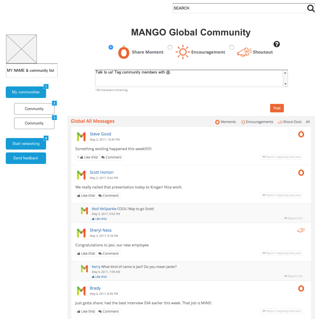
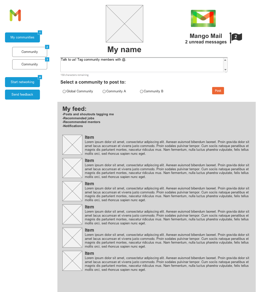
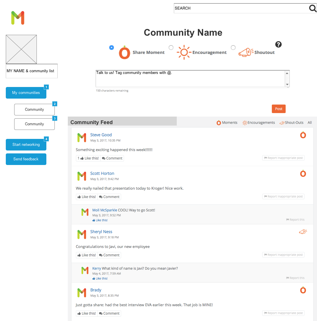
I created the wireframes below to incorporate a few of these recommendations. (Click to tab through the wireframe gallery)
Page one of user script: